Blue Box
Product Design • Multimedia Design
Designed an innovative digital kiosk interface to check out books for a final project taken in UNC-Chapel Hill’s Hussman School of Journalism and Media.
— Overview —
Blue Box was created as the final project for my Multimedia Design course, where we were tasked with investigating digital problem or challenge that needs to be solved.
Course:
Multimedia Design
(MEJO 581, UNC-Chapel Hill)
Duration:
2 months
— The Problem —
For this final class project, we were all tasked with defining and scoping a design research question relevant to our area of interest. I decided to expand on the School of Information & Library Science’s (SILS) marketing throughout campus.
How might we increase the School of Information and Library Science’s visibility on campus for those who aren't familiar with the program?
While not part of the class requirement, I decided to administer a brief online survey on Qualtrics to UNC students and alumni to gauge their prior knowledge with the subject. The responses reinforced my argument that SILS’s identity at UNC is still ambiguous to those who are not directly associated with the school.
For instance, preliminary research findings from the survey include:
7 out of 12 respondents did not know where SILS was located on campus, nor did they know it was nationally ranked in its field.
When asked to explain what SILS is, the most common answers given were “I don’t know” and “organizing data.”
Despite this, when given the opportunity to browse the course catalog, over half of the surveyed participants said they were interested in taking a SILS class.
— My Solution —
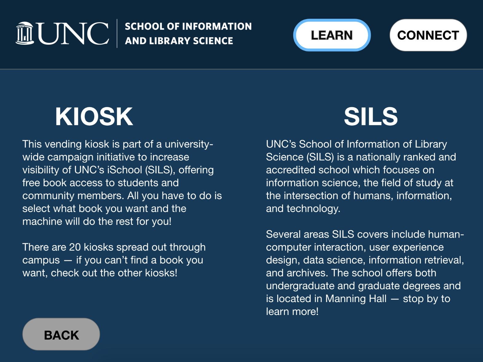
After getting validation that the iSchool at UNC needs more visibility throughout campus, I wanted to propose a solution which would combine an innovative and unique digital experience to help market it better for the UNC community. After brainstorming, I felt that automated retail kiosks would be a solution that would be eye catching, interactive, and informative.
Launch a campus-wide marketing campaign by installing automated retail kiosks throughout campus for books.
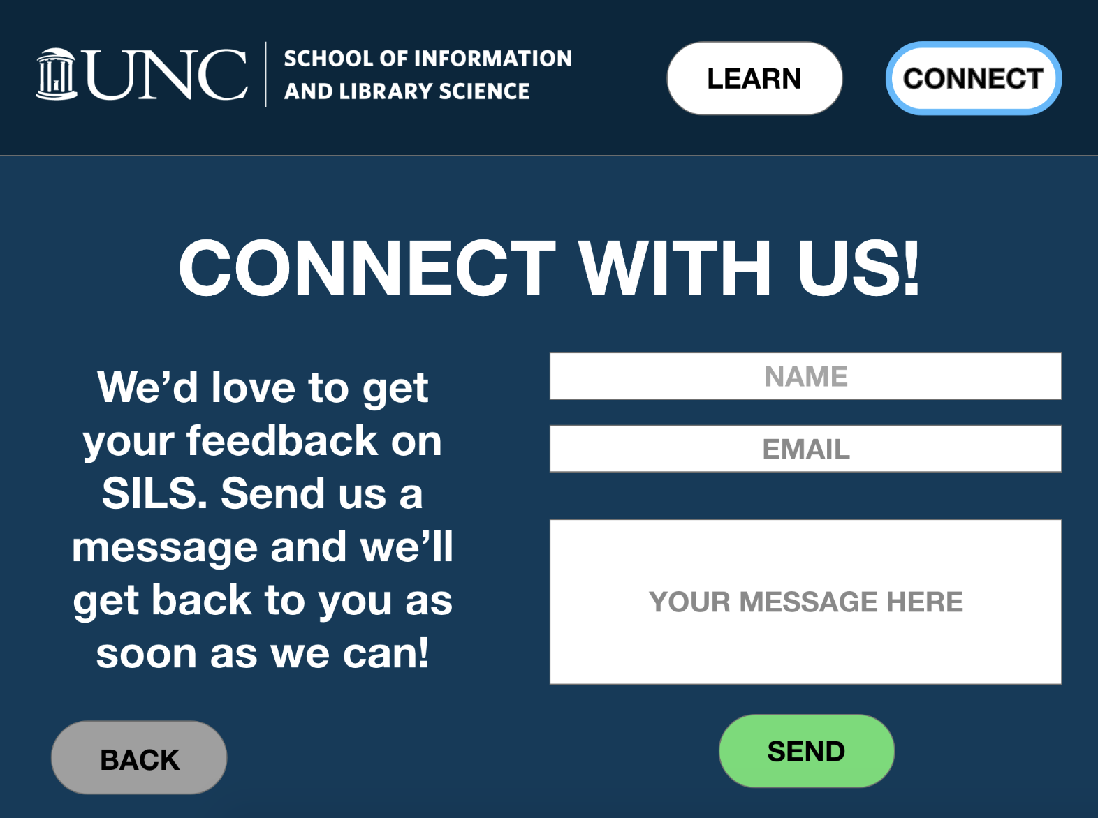
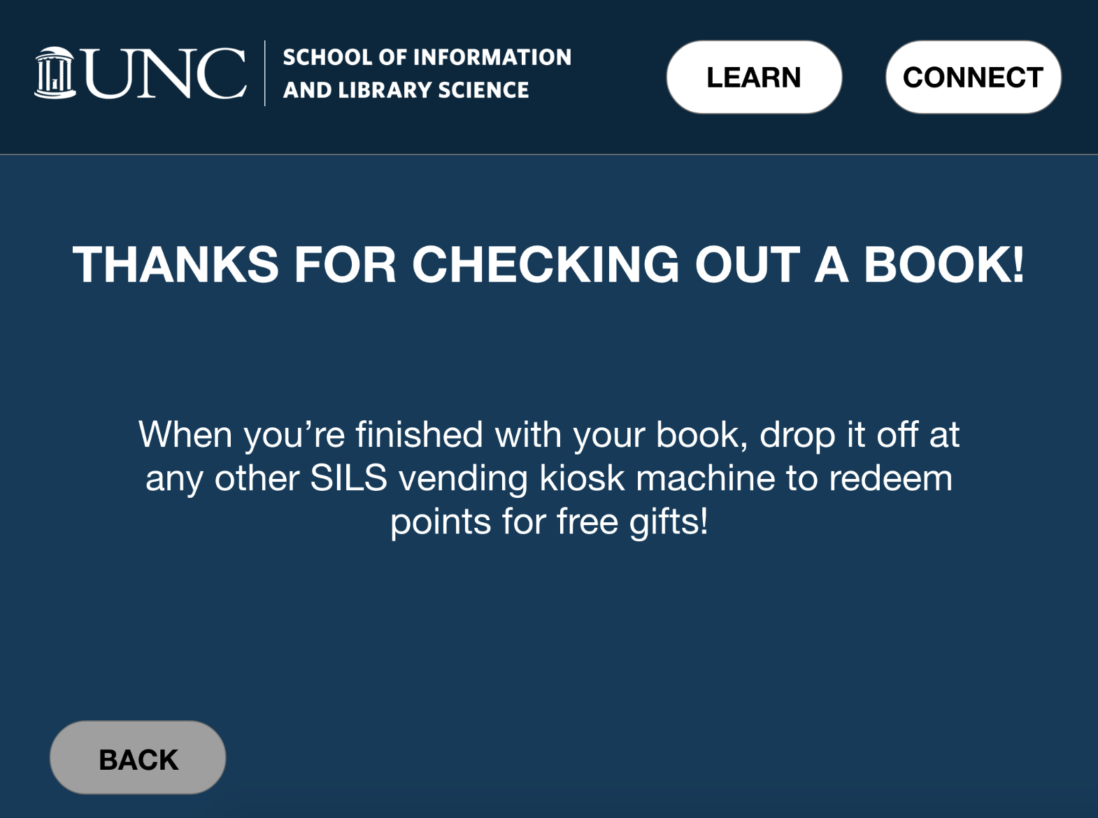
These kiosks would allow users to take and leave books (similarly to Red Box) simply by scanning its barcode into the system, and would also have a digital interface to inform users about SILS, the marketing initiative, and how to get involved. This project merges both the information and library sides of the school with the hopes of redefining what Information and Library Science means to the UNC community.
I also defined a success metric for this project, which would be heavily dependent on the users who interact with the system. For this project, the success metric is whether an end-user ends their journey with some knowledge or interest about SILS they didn’t have prior to interacting with the system.
— User Personas —
The first step I took after defining the problem statement and proposing a solution was observing potential users for the system. To do this, I sat down for an hour at UNC’s student union and took observational notes on people who passed by and noted their interactions and actions.
Ultimately, I concluded that the product would be targeted toward the UNC community, while keeping in mind the fact that prospective students and families would be touring the school too (who might be potentially interested in SILS).
I gathered and analyzed my notes and created 3 distinct user personas to help inform my design decisions for later on in the process. I specifically tried to highlight their prior technology and SILS knowledge, as well as common frustrations they might experience.
*Click on an image to expand
— System Information Architecture —
After gaining a better understanding of the system’s users, I then transformed my conceptual idea into a system architecture representation. I first started by listing all the assets the interface would eventually have (e.g. buttons, images, graphics, fonts, color codes, and icons), as well as different types of content I wanted the system to have.
At this stage of the process, I was also thinking about secondary functional features the system has. For instance, the system would automatically reset to the default welcome screen if it hasn't been touched for more than 10 seconds.
Information system architecture (click to expand)
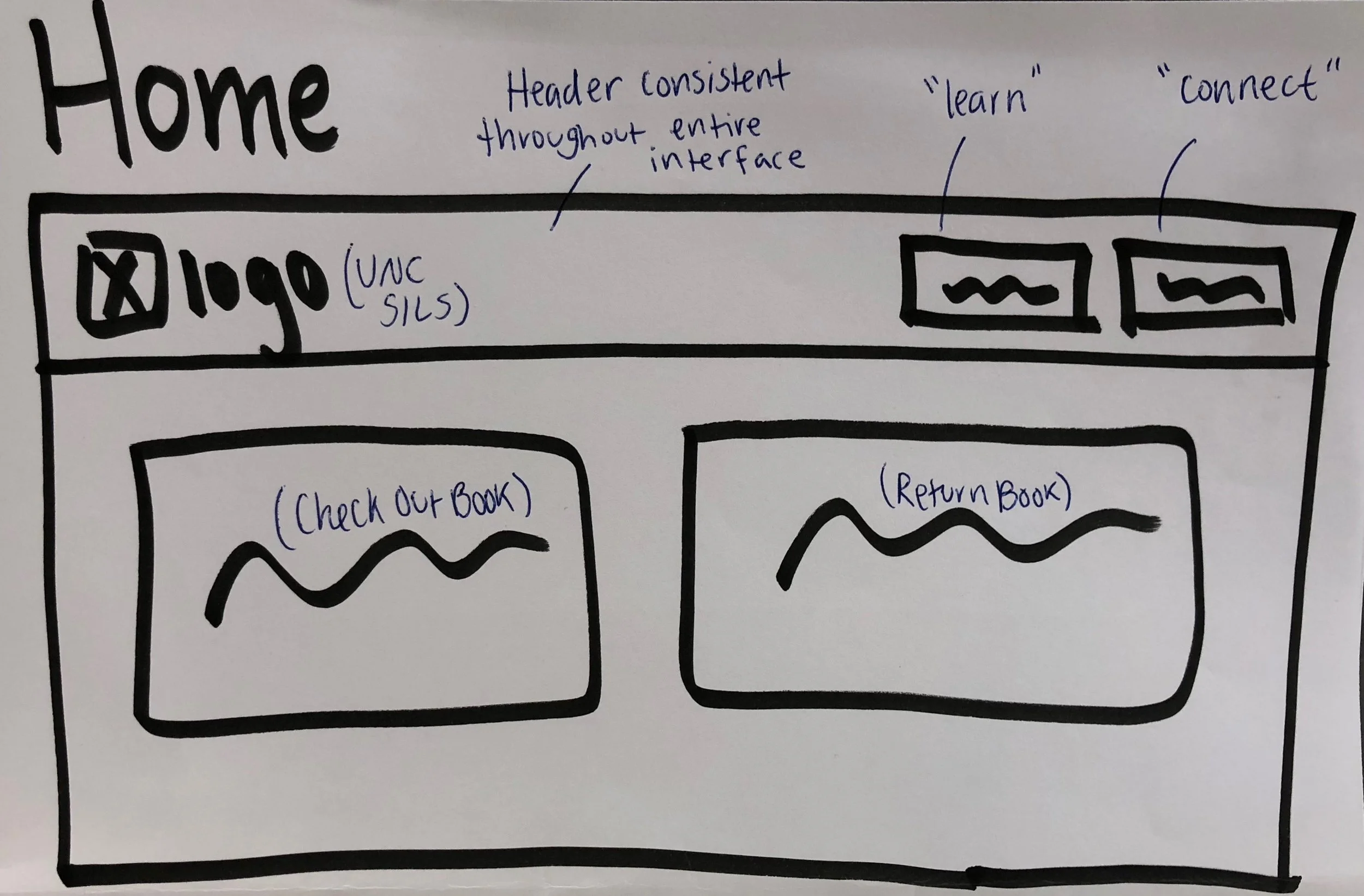
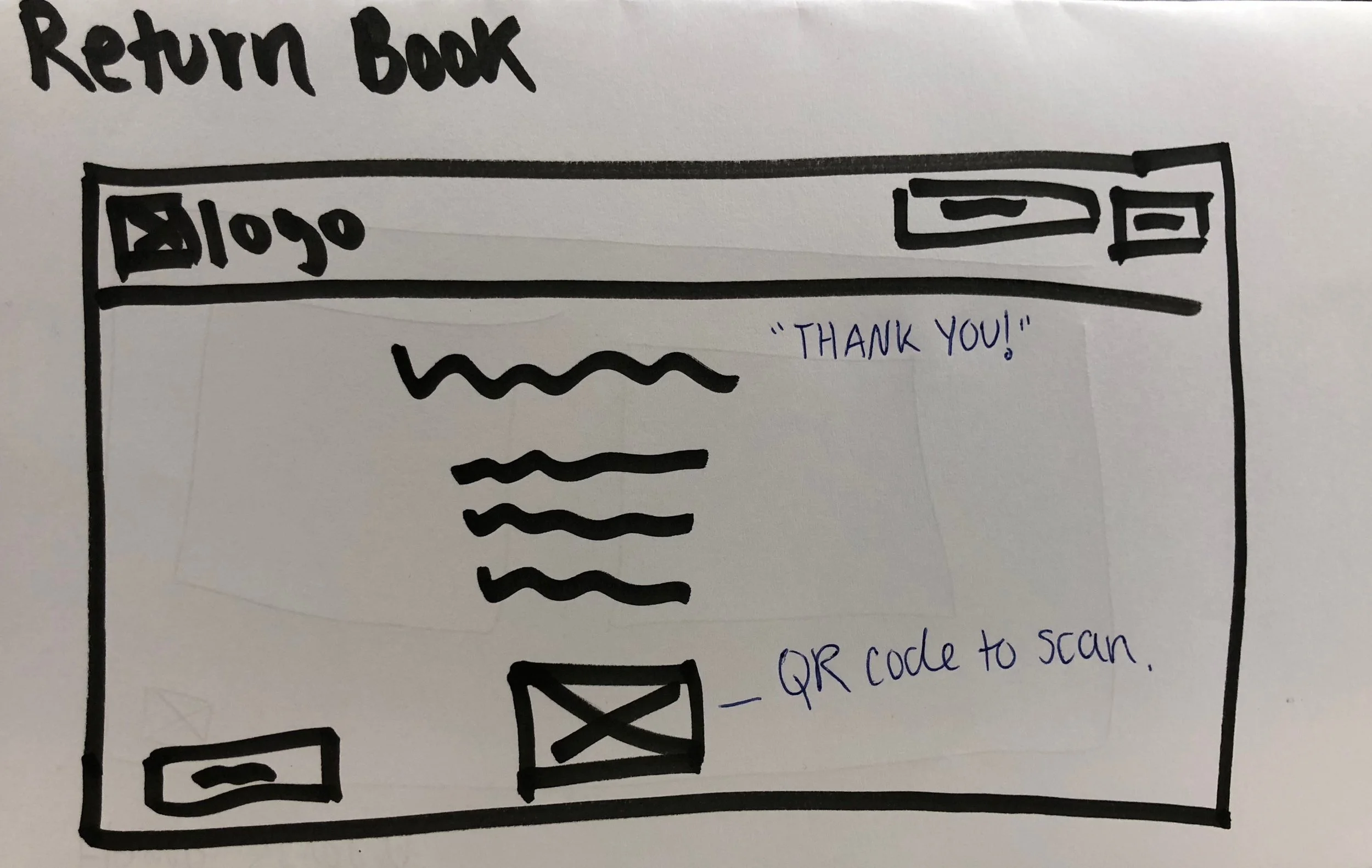
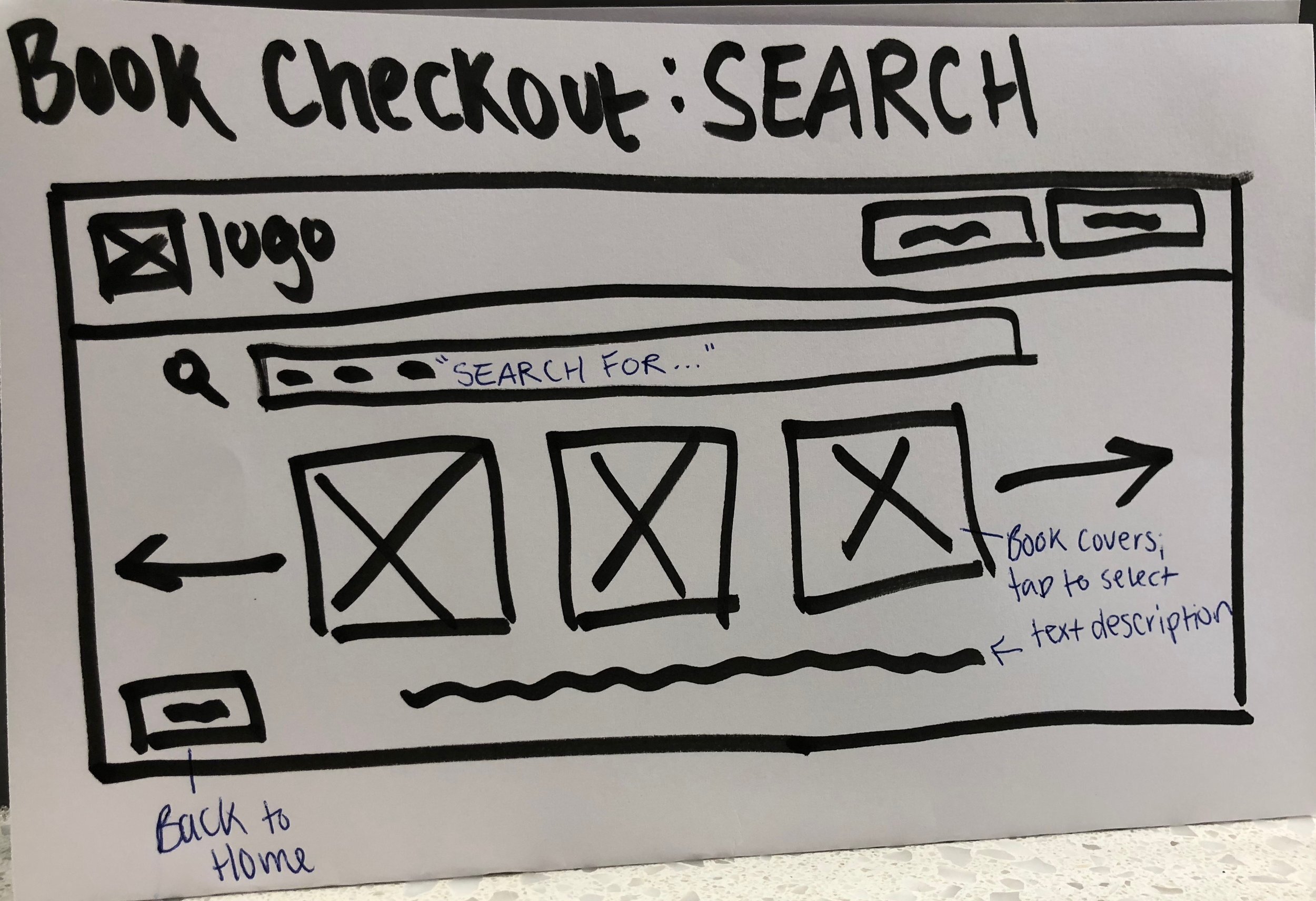
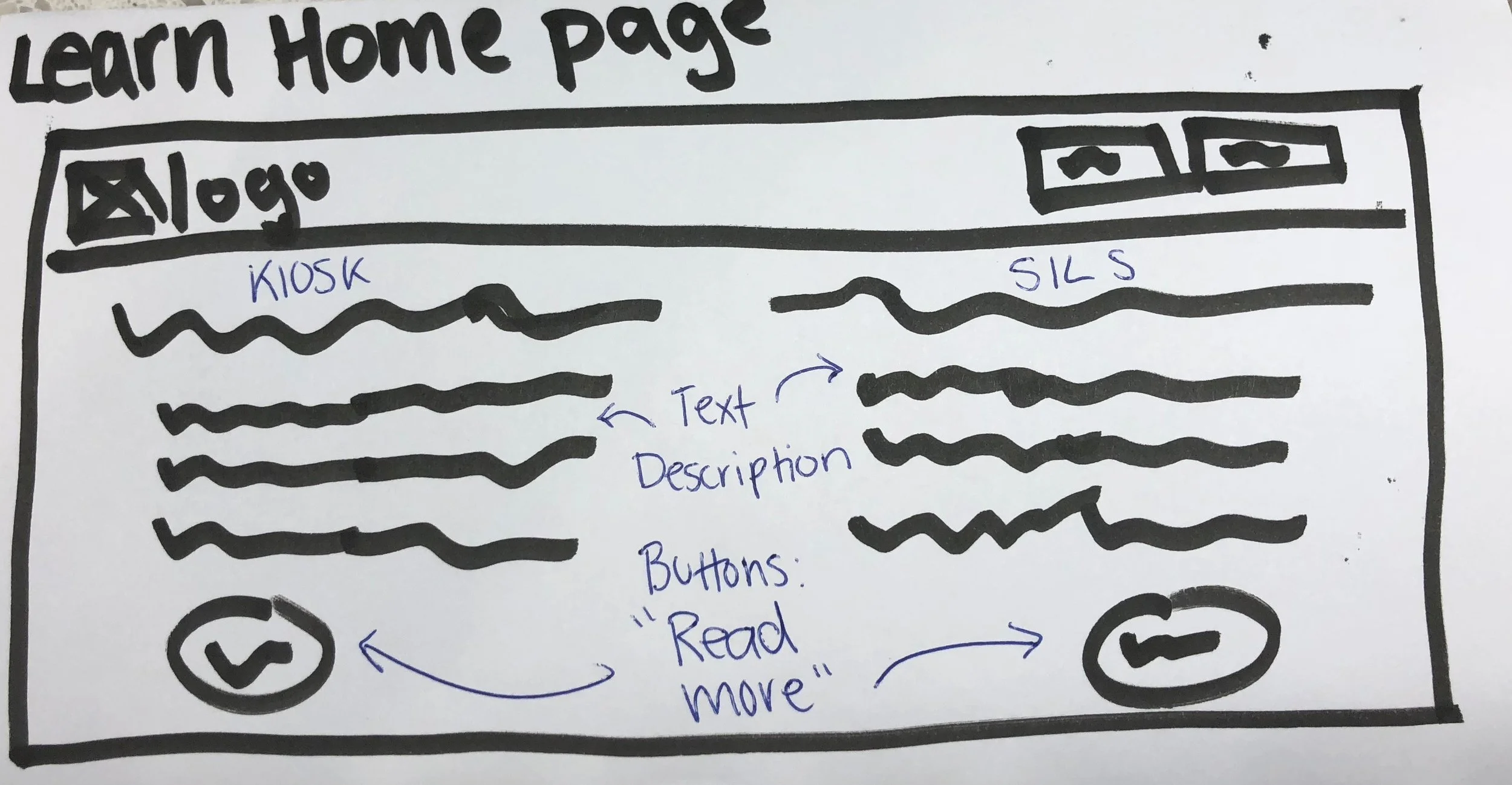
— Low-Fidelity Wireframes —
My next step in the design process was now to put my ideas onto paper by creating low fidelity wireframes. I approached this by first drafting the basic visual layout in black marker. Afterwards, I went back through and annotated the wireframes in blue to show basic text and interactions.
One thing I kept in mind during this step is that the UI is designed for a tablet-sized digital kiosk. Because of this physical size constraint — and assumption that users would not spend a lot of time on it as they are most likely just passing by — I also decided that the interface would rely heavily on visual queues and large buttons.
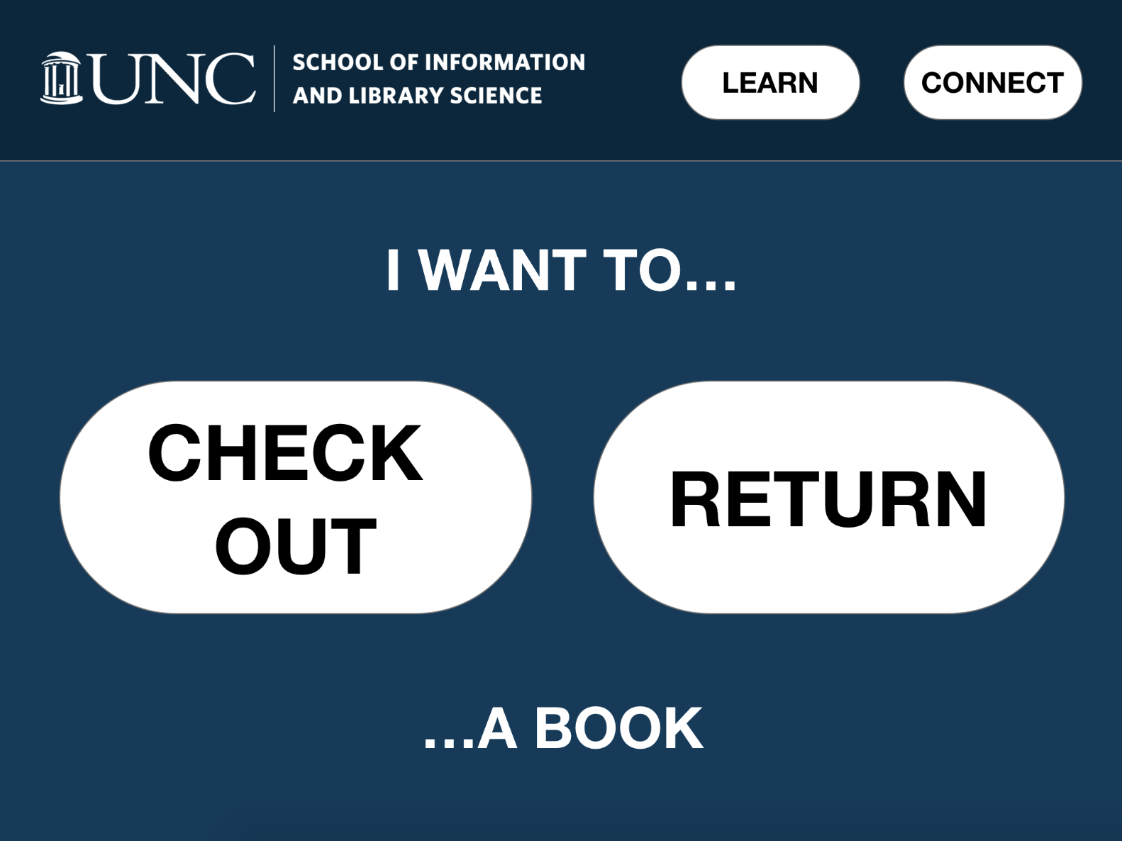
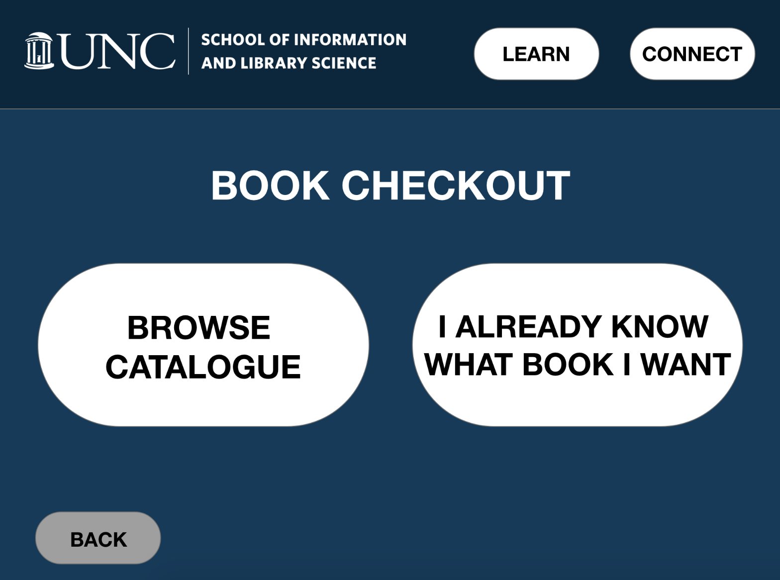
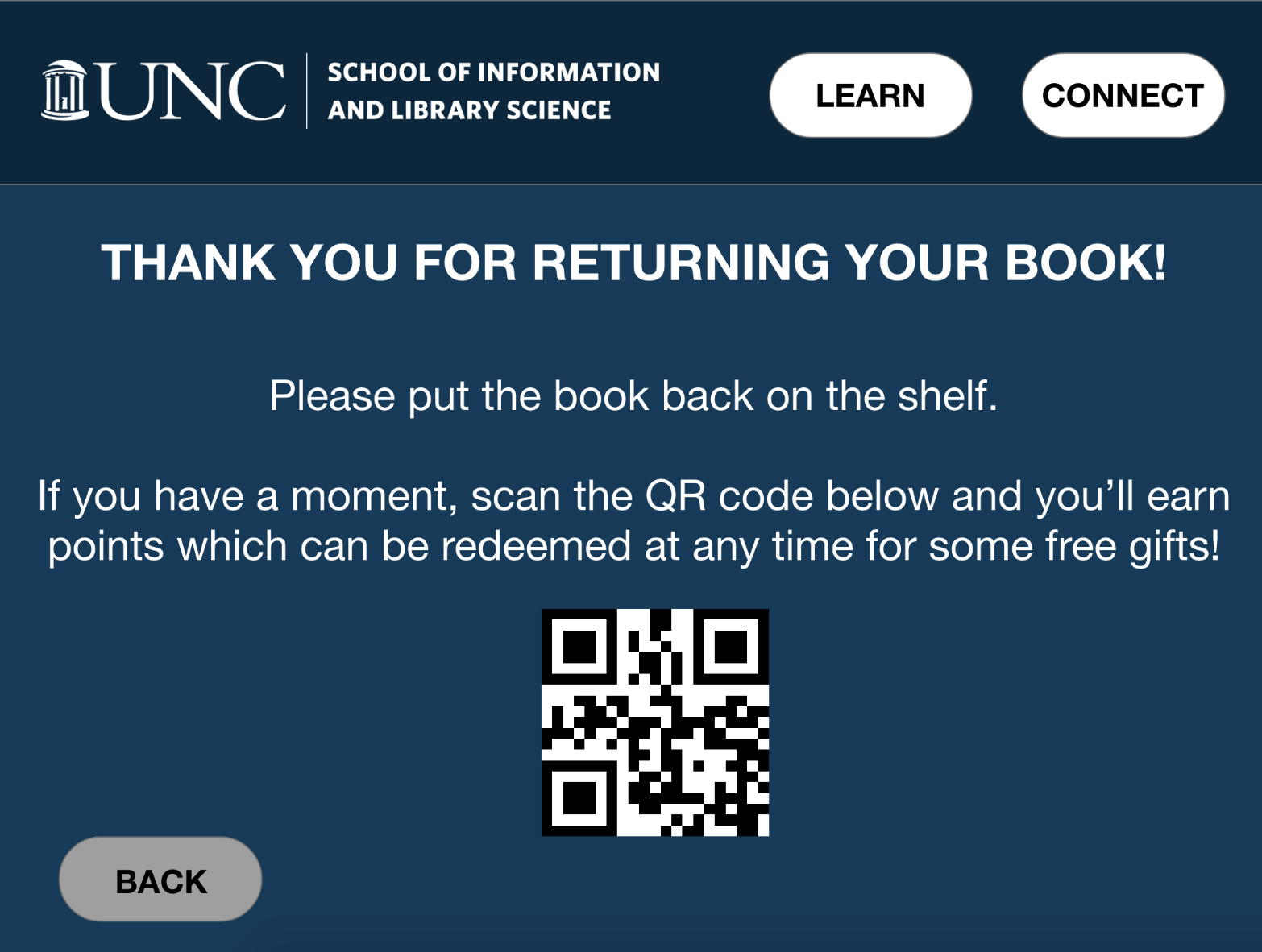
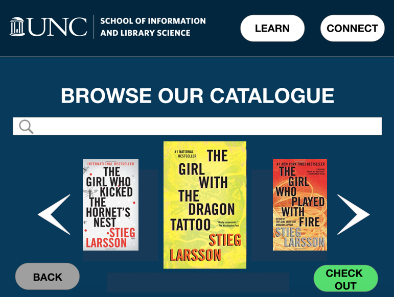
— High-Fidelity Prototype —
After creating low-fidelity wireframes, I went to Adobe XD to create landing pages decided in Step 4.
High Color Contrast
For accessibility & context
(e.g., some kiosks would be placed outside and have sun glare, or be in a busy area)
Familiar Color Palette
Color palette is taken from from the SILS website to instill the brand into the product
Large Buttons & Consistent Shapes
To provide affordances on where to tap
— Reflection —
This product/design concept was for my very first design class I ever took at UNC and while not perfect, I was pleased with it for only having several weeks to complete it. I enjoyed being able to follow the product lifecycle, from conceptualization to a fully-designed interactive prototype.
If I could re-do it, I would have liked to spend more time on the user interface of the prototype — including conducting usability tests on it!